Closed header
A 64px cream header with the supplied short logo and three 44px utility targets.

Interactive mobile directions, responsive content journeys, and the proposed product content architecture shown together before the patterns are mapped into Shopify.
The short ICO logo now anchors the left edge while Search, Cart, and Menu stay in a predictable utility cluster. Browsing moves through focused screens instead of lengthening one accordion drawer.
The Search control is in its final header position and emits the integration event for the upcoming Search design task. No temporary search overlay is shown in this prototype.
A 64px cream header with the supplied short logo and three 44px utility targets.
Four primary destinations, compact utilities, and the two conversion actions.
A focused second-level screen with a visible Back control and direct destinations.
Four-column swatches maintain generous touch targets without turning the menu into a long list.
The right-side theme behavior is represented with a mobile full-width empty state.
Your cart is empty.
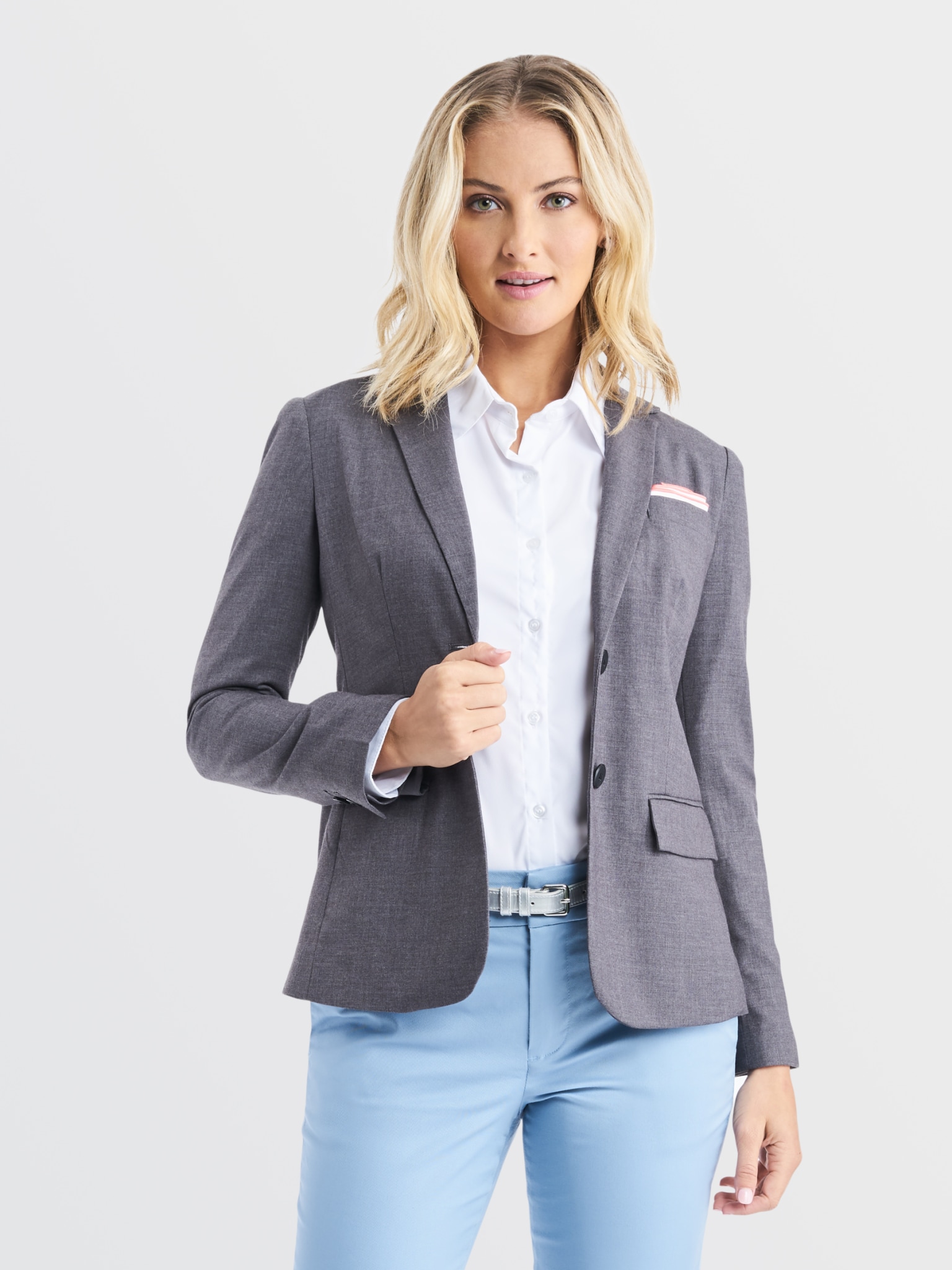
Browse uniformsThis module supports page-specific image or video media while retaining ICO typography, CTA styling, contrast, and mobile-safe spacing.
A full-width storytelling module for industries, services, campaigns, and conversion pages.
The same media layer accepts muted native or external video, a mobile-specific source, and this image as its poster and reduced-motion fallback. Final video footage can be added without changing the content layout.
Open each working view in sequence to review message hierarchy, product browsing, swipe media, saved looks, and persistent Favorites behavior.
The standardized approach keeps the heart interaction fast during browsing, then reveals list organization only when it is useful. Looks and garments remain distinct inside each list, while the same save behavior is used in Shop, Product, and Gallery.
The first heart tap saves directly to the default Favorites list and confirms the action without opening a large dialog.
The confirmation offers Choose Lists. Returning to an already-saved item opens the same compact list sheet, with named lists and list creation in one place.
The Favorites overview uses four-item previews for fast scanning. Each list separates Looks and Garments, lets saved items move between lists, and supports a read-only share link.
A shopper can keep moving through products and looks. List management no longer interrupts every first save.
The same icon, selected state, confirmation, and list sheet appear across every commerce and inspiration surface.
Named lists and sharing remain available for program work without making the common save action feel administrative.
Default Favorites, multiple named lists, browser-persistent prototype state, separate Looks and Garments views, list management and item moving, and read-only sharing.
Collaborative editing, list copying, CSV or PDF export, administrative reporting, and B2B, CRM, or other downstream integrations.
The product template combines native Shopify product data, product-specific metafields, shared storefront policies, and recommendation data. Each source has a defined place so the description stays useful without becoming a catch-all field.
The prototype shows the intended division between product storytelling, structured specifications, fit and care support, program services, and related merchandise.
| Product content | Shopify source | Rendered in | Primary owner |
|---|---|---|---|
| Title, price, media, options | Native product and variant fields | Gallery, heading, pricing, selectors, and cart controls | Merchandising |
| Introductory description | product.description | Product Details introduction | Merchandising |
| Department and style number | custom.department, custom.style_number | Product identity above the price | Merchandising |
| Fabric and construction | custom.product_specs list of product_spec metaobjects | Structured Product Details grid and feature list | Product operations |
| Size guide | custom.size_guide metaobject reference | Size Guide accordion | Product operations |
| Care instructions | custom.care_instructions rich text | Care Instructions accordion | Product operations |
| Decoration guidance | custom.decoration_guidance rich text | Decoration Options accordion | Program team |
| Companion product | custom.companion_product product reference | Companion product module | Merchandising |
| Shipping and returns | Shop-level or theme setting | Shipping & Returns accordion | Store operations |
| Related products | Shopify Search & Discovery recommendations | Complete Your Program product shelf | Merchandising |
Product Details opens first. Empty optional sections do not render, the native description appears only once, and structured specifications stay separate from the narrative description so content remains easy to maintain.
Review the longer sales and education templates with compact primary content, swipeable secondary shelves, accessible filtering, and chapter-level reading controls.
Logo rail, process, proof
Compact lists, style shelves
Primary service index
Capabilities, process, FAQ
Search, filter sheet, shelves
Stage navigation and rails
Sticky chapters, responsive table
Summary rail, decision table
Touch-ready task rows
Focused editorial reading
Proof modules and takeaways
